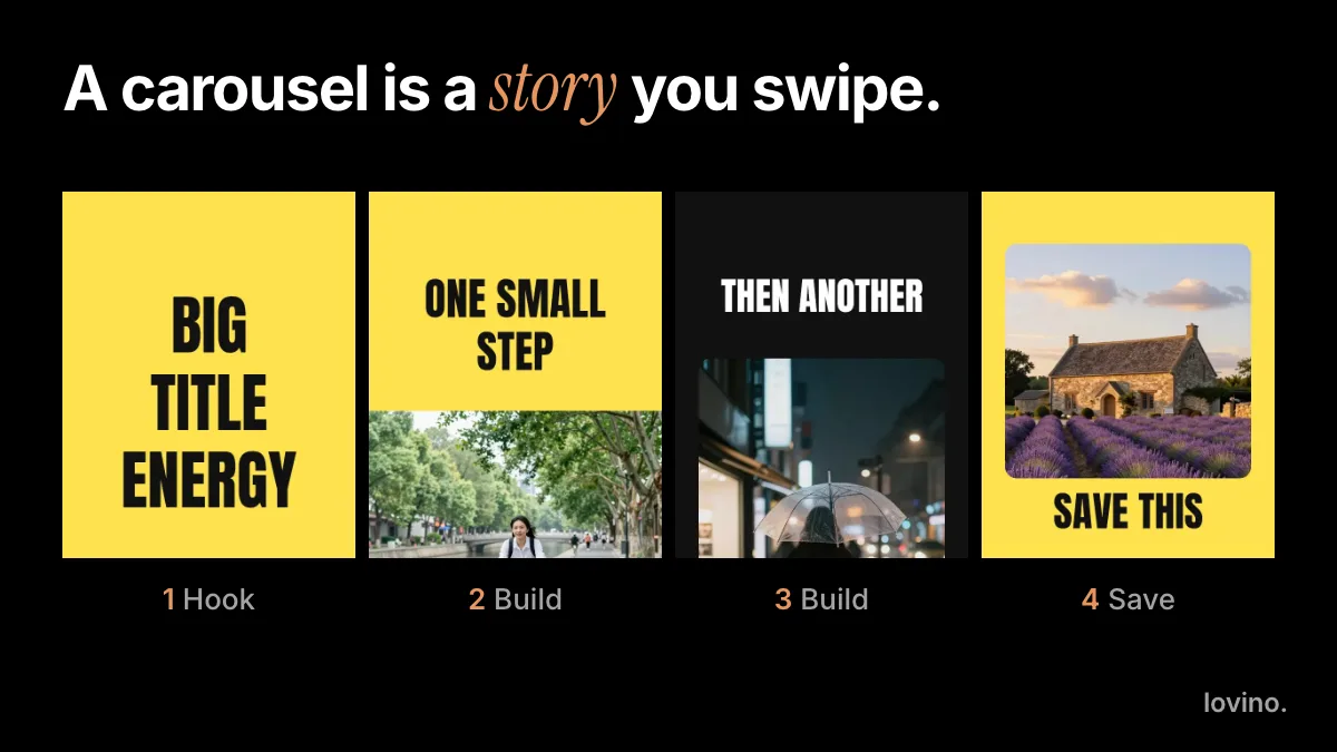
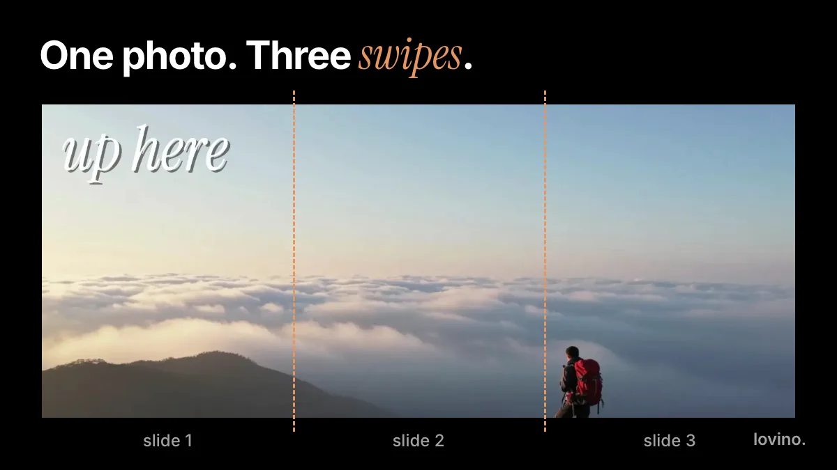
Instagram Carousel Size (2026): Dimensions, Ratios, Safe Zones
Instagram carousel size in 2026: use 1080 × 1350 pixels (4:5) for every slide, keep text inside the safe zone, and know the slide limit. Table and diagrams.
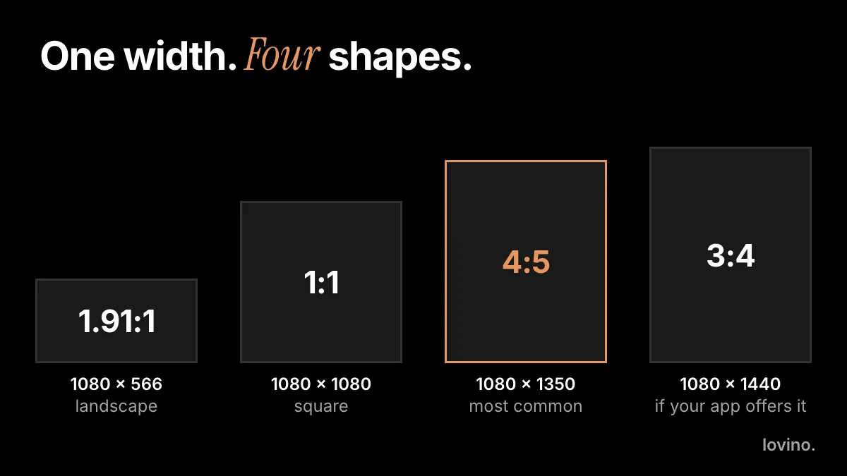
The best Instagram carousel size is 1080 × 1350 pixels, a 4:5 portrait, used on every slide. Square (1080 × 1080) is the safe second choice. A carousel can hold up to 20 photos and videos, according to the Instagram Help Center. Keep your key content near the middle of each slide, because grids, previews and crops trim the edges first.
Instagram changes its app often, so treat the numbers below as the common working sizes, not rules Instagram enforces. The crop preview in your own composer has the final word.
What is the best Instagram carousel size?
Work at 1080 pixels wide. That is the usual working width for feed images, and a larger file is scaled down anyway. The height then depends on the shape you pick.
| Ratio | Pixels | Best for | Watch out for |
|---|---|---|---|
| 4:5 | 1080 × 1350 | The usual choice. Fills the most feed space. | Previews can trim the edges. |
| 1:1 | 1080 × 1080 | A safe shape that never looks wrong. | Takes less screen than 4:5. |
| 1.91:1 | 1080 × 566 | Wide scenes. | The smallest on screen. |
| 3:4 | 1080 × 1440 | A taller portrait. | Not every composer offers it. Check yours before you design for it. |
| 9:16 | 1080 × 1920 | Stories and Reels. | Not a feed carousel shape. Expect a crop. |
If you remember one row, make it 4:5. It is also the portrait shape Lovino's Carousel Set skill offers, next to square.
Do all carousel slides need the same size?
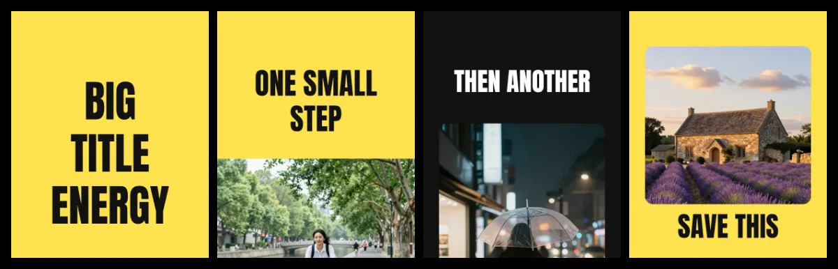
Yes. The Instagram Help Center says the orientation you choose (square, portrait or landscape) applies to every photo and video in the post, and you cannot pick a different one for each. You can drag an item in the composer to adjust its crop, but it is easier to design every slide at the same ratio and skip the surprise.
Here is a four-slide set where every slide shares the same 4:5 shape:
Mixed media is allowed. The same Help Center page says a carousel can hold photos and videos together, so a clip can sit between stills as long as it fits the same frame.
How many slides can an Instagram carousel have?
Up to 20. That is a ceiling, not a target. Add a slide only when it carries a new point, and cut any slide that repeats an earlier one. Lovino's Carousel Set skill suggests three to five slides because a small set is easier to keep consistent. For the whole workflow, see how to make an Instagram carousel.
Which is better for carousels: 4:5 or 1:1?
Both work, so choose by where else the slides will go. 4:5 takes more vertical space in the feed, so each slide gets more of the screen. 1:1 is safer if you also post the same images elsewhere, because it survives most square crops without losing anything. Mixing them in one post is the only wrong answer.
A quick rule: 4:5 for slides made for Instagram, 1:1 for slides you will reuse on other platforms. Either way, keep the text inside the safe margin so a crop does not cut it.
What file format and resolution should slides use?
Export each slide at 1080 pixels wide as a JPG or PNG, the formats every tool handles. A larger file is scaled down, and a smaller one looks soft on a modern phone. Skip heavy compression before you upload, because Instagram compresses the file again.
What about video slides in a carousel?
A video slide follows the same frame as the stills. If you make clips in Lovino, check each model's ratios first. As of October 2026, the Seedance model page lists 3:4 and 1:1 among its ratios, and Hailuo lists 9:16, 16:9 and 1:1. None of these is exactly 4:5, so for a 4:5 set, generate a 3:4 or 1:1 clip and check the crop in the composer.
Where is the safe zone for text and faces?
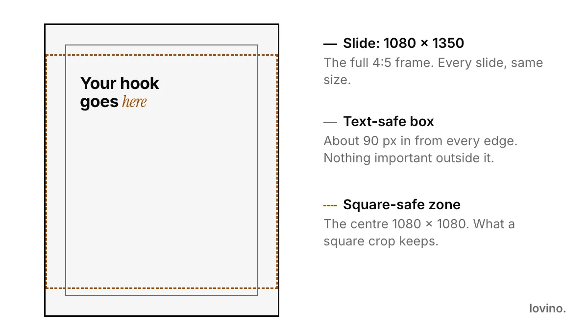
A safe zone is the part of the slide that survives every crop. Two guides cover almost every case:
- A text margin. Keep words about 90 pixels in from every edge of a 1080 × 1350 slide. This is a rule of thumb, not an Instagram number.
- A square core. Keep the key subject inside the centre 1080 × 1080. A square crop of a 4:5 slide keeps exactly that part.
Your profile grid shows one tile per post, and the tile shape has changed over the years. Look at how your own grid crops a post before you design around it, and keep the subject near the centre so any crop keeps it.
How do you make carousel slides at the right size with AI?
Pick the ratio first, then generate. An image model composes for the shape you give it, so the subject lands where it should instead of being chopped by a crop afterwards.

The same photo changes character at each shape. That is why the ratio is a decision you make before you generate, not after.
- Open Studio and choose Image. The ratio picker offers 1:1, 2:3, 4:3, 4:5, 16:9 and 9:16. Choose 4:5.
- Check what the model supports. GPT Image 2, the model built to render text, offers 1:1, 3:2 and 2:3 in Lovino. For 4:5 slides with words, make a 2:3 image and crop it to 4:5, keeping the words in the middle. See GPT Image 2.
- Check the pixel size of the download. If an image is smaller than you need, run it through the AI image upscaler first.
- Keep one ratio for the whole set. Do not mix 4:5 and 1:1 inside one post.
The aspect ratio guide covers other platforms, such as Stories and YouTube. Signup is required to generate, free outputs carry a watermark, and paid plans remove it.
What are the most common size mistakes?
- Mixing ratios. One landscape slide in a portrait set gets cropped to fit, because the post has only one orientation.
- Text at the edge. Words a few pixels from the border are the first thing a crop removes.
- Tiny type. People read slides on a phone. If you squint at 100 percent zoom, make the type bigger.
- Cropping after the fact. Generate at the final ratio instead of trimming a different shape.
- Forgetting the cover. Slide 1 is the tile in the grid and the first thing in the feed. Design it to work alone.
Want slides that join into one wide picture? Each slide stays 1080 × 1350 and the canvas grows; how to make a seamless panorama carousel has the width table. LinkedIn works differently because it takes a PDF, so see the LinkedIn carousel guide.
Set the size before you generate
Choose 4:5, keep the text inside the margin, and make the cover work on its own. Then open the AI image generator, set the ratio, and make your first slide.
Questions, answered.
What size should Instagram carousel images be?
1080 × 1350 pixels (4:5) is the common choice, with 1080 × 1080 (1:1) as the safe alternative. Make every slide the same size, keep text away from the edges, and check the crop preview in your composer, because Instagram can change its formats.
How many slides can an Instagram carousel have?
Up to 20 photos and videos in one post, according to the Instagram Help Center. That is a maximum. Most carousels work best with only as many slides as the idea needs.
Does Instagram crop carousel slides?
It can. The Instagram Help Center says the orientation you choose applies to every photo and video in the post, and you can drag each one to adjust its crop. Your profile also shows the first photo or video as the post's tile. Keep important content near the centre and use one ratio on every slide so a crop does not remove it.
Can I mix photos and videos in a carousel?
Yes. The Instagram Help Center says a carousel can include photos and videos together. Keep the same frame shape for every item so nothing is cropped unexpectedly.
Which ratio should I pick for AI-generated slides?
Pick 4:5 in Studio before you generate, so the model composes for the final shape. If you use GPT Image 2, which offers 1:1, 3:2 and 2:3, generate 2:3 and crop to 4:5, keeping any words in the middle.