AI Phone Wallpaper Prompts: Size, Safe Zones, Styles (2026)
AI phone wallpaper prompts that work: the right 9:16 size, safe zones for the clock and icons, five styles and how to get a sharper 4x copy.
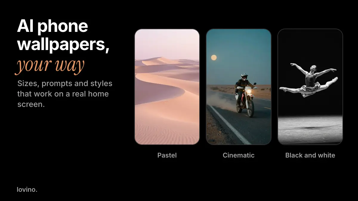
A good AI phone wallpaper starts with the prompt and the shape. The recipe is short: pick a tall 9:16 shape, describe the scene, colours and mood, keep the top and bottom calm, and upscale if you want a bigger file. To make one now, open Lovino's AI wallpaper generator. This guide is the playbook behind it: prompts, sizes, safe zones and styles.
A wallpaper is a strange kind of picture. A clock sits on top of it, icons cover half of it, and you look at it more often than at almost anything else you own. So the usual "make it dramatic" advice backfires. This guide is about making a picture that still works with a phone's furniture on top.
What size should an AI phone wallpaper be?
Choose the shape before you write a word, because the shape changes the composition.
| Screen | Shape to pick | Note |
|---|---|---|
| Phone | 9:16 (tall) | Suits most phones. Some phones crop the top or sides a little. |
| Desktop or laptop | 16:9 (wide) | Same price as the phone shape on the fast model used here. |
The 9:16 pastel dunes wallpaper in this guide was made with Z-Image Turbo at 768 by 1344 pixels. That is enough for many phones, but for a bigger copy, run it through the Upscaler. Its 4x setting turned that file into 3072 by 5376 pixels, more than a 2160 by 3840 pixel 4K portrait screen. The Upscaler uses paid credits. Our aspect ratio guide and upscaler guide go deeper.
How do you write a wallpaper prompt?
Think in five parts: scene, colours, shapes, mood and format. The last part matters more than it looks, because it tells the model the picture is a wallpaper and not a poster.
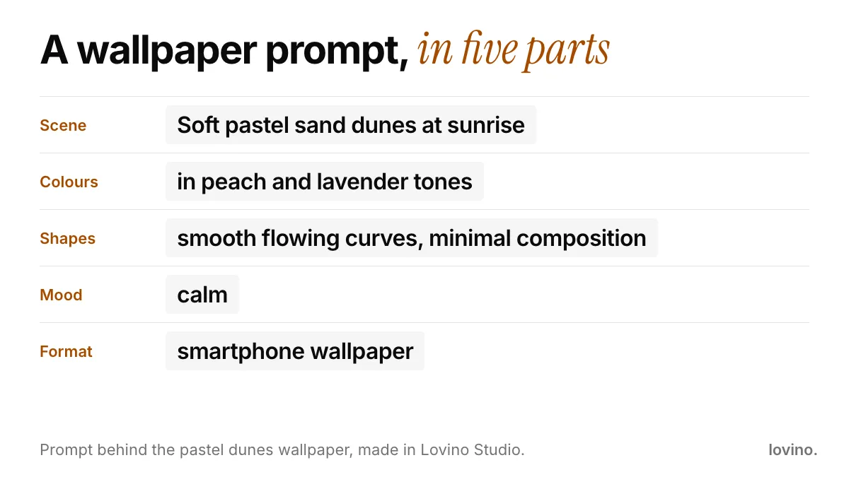
Here is that prompt in one line, followed by the two that made the other phones in the cover image:
Soft pastel sand dunes at sunrise in peach and lavender tones, smooth flowing curves, minimal composition, calm, smartphone wallpaper
A motorcyclist parked on an empty desert highway at dusk, dust hanging in the air. cinematic still frame, anamorphic lens with oval bokeh, teal and orange color grading, shallow depth of field
A contemporary dancer frozen mid-leap on an empty stage, arms stretched wide, fabric flowing. high contrast black and white photography, deep crushed blacks and bright blown-out highlights, fine silver halide grain
Notice that the first prompt asks for "minimal composition" and "calm". Those two phrases do more for a wallpaper than any camera term. Our guide to AI image prompts has more wording to borrow.
Where should the subject go?
Think of a phone screen as three bands. The top holds the clock and widgets. The middle is where your subject can live. The bottom is covered by icons and the dock.

These bands are illustrative, since layouts vary by phone and by system. The habit still holds: keep fine detail out of the top and bottom, and put the one thing you want to see in the middle. Notice how much of the dunes picture disappears once icons sit on it, and how the plain sky keeps the clock easy to read.
That clock needs contrast. The W3C's web accessibility guidance asks for a contrast ratio of at least 4.5 to 1 for normal text and 3 to 1 for large text. It was written for web pages, but it is a useful floor for a lock screen. If the sky behind your clock is mid-grey and busy, the time will be hard to read, so ask for a darker or plainer area up there.
Which styles make good wallpapers?
| Style | Prompt cues | Why it works |
|---|---|---|
| Minimal pastel | "minimal composition", "soft", a two-colour palette | Calm behind icons |
| Cinematic still | "cinematic still frame", "teal and orange", "shallow depth of field" | Feels like a film frame |
| Black and white | "high contrast black and white", "deep blacks" | Icons stay legible on dark areas |
| Golden hour | "golden hour", "warm backlight" | Warm and friendly |
| Soft abstract shapes | "smooth curves", "plain background" | Rarely clashes with widgets |
Here are a golden hour result and a cinematic one, both AI-made:
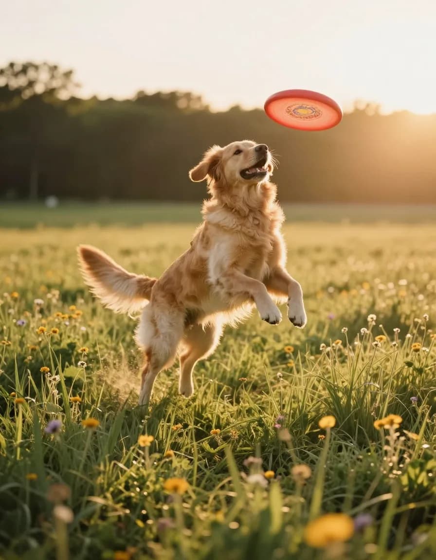
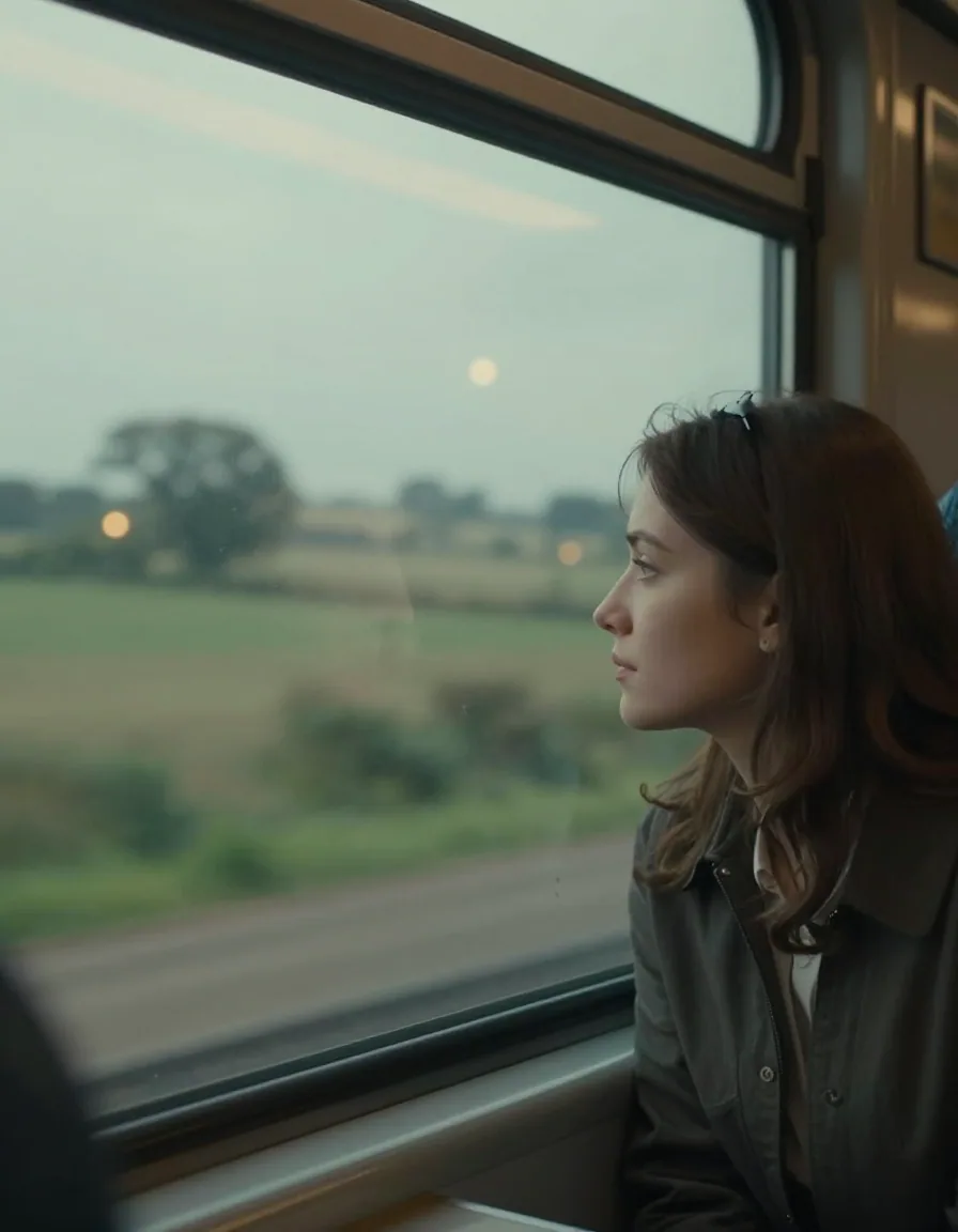
Both are 896 by 1152 pixels, a portrait shape but not 9:16, so they show the look rather than a ready-to-set wallpaper. Set 9:16 before you generate when you want the real shape. For cinematic wording, see how to make cinematic AI images.
How do you choose colours and mood?
Colour does most of the work on a wallpaper, so name it. Two or three colours beat a rainbow, and soft tones behind icons are easier on the eye than loud ones.
- Calm and clean: peach and lavender, sage and cream, or pale blue and white.
- Moody and deep: teal and orange at dusk, or near-black with one warm light.
- Warm and friendly: golden hour light, amber tones, soft shadows.
Then add one mood word, such as "calm", "quiet" or "dreamy". The dunes prompt uses "calm", and the result leaves plenty of empty space for the clock and icons.
How do you make a matching set?
Keep the style words fixed and change only the scene. For example, keep "soft pastel, minimal composition, calm, smartphone wallpaper" and swap the sand dunes for a still lake, a foggy forest or a pale mountain. You get a family of wallpapers that belong together, which is handy for a lock screen and home screen pair.
How do you make the wallpaper in Lovino?
- Open Studio and pick a fast model. Z-Image Turbo costs 1 credit a picture, the free daily credits cover it, and it is enough for wallpapers.
- Set the shape in the ratio menu: 9:16 for a phone, 16:9 for a desktop.
- Paste your prompt and generate. Try three versions and keep the calmest.
- Upscale if you want more pixels. Open the Upscaler and choose 4x.
- Download it and set it yourself. Lovino does not change your device settings, so apply it from your phone's wallpaper menu.
You need an account to generate. Free results carry a watermark, which is a poor fit for a wallpaper. Paid plans remove it, and every user can use their results commercially. Pricing lists the plans.
What to avoid on a wallpaper
- Busy detail behind icons. Crowds, foliage and patterns turn the home screen into noise.
- Words in the picture. AI can misspell, and text under a real clock looks cluttered. Leave it out.
- A face right under the clock. The clock and widgets will sit on top of it. Put people in the middle band.
- Presenting it as a photo. If you share your wallpaper as a photograph, say it is AI. See AI content disclosure.
- Real people you do not have rights to. Make characters or scenes instead. If you want a wallpaper of yourself in a stylised look, start with an AI avatar.
Uploaded images are processed by third-party AI providers, which matters if you start from your own photo.
Quick checklist before you set it
Check the shape (9:16 for a phone). Check the middle band for the subject. Check that the clock area is plain. Then set it, lock your phone, and look at the real thing. If something fights the clock or the icons, regenerate with "calm, minimal composition" added.
Ready to try? Open the AI wallpaper generator, choose 9:16 and paste the pastel dunes prompt above. Swap the colours, and it is yours.
Questions, answered.
What size should an AI phone wallpaper be?
Pick 9:16 for a phone before you generate, since that tall shape suits most phones. Some phones crop the top or sides a little, so keep the subject near the middle. The 9:16 example in this guide is 768 by 1344 pixels; use the Upscaler for a larger copy.
How do I get a 4K phone wallpaper from AI?
Make the wallpaper in Studio, then run the Upscaler at 4x. The 9:16 example, made at 768 by 1344 pixels, became 3072 by 5376 pixels, more than a 4K portrait screen. The Upscaler uses paid credits.
Can I make a desktop wallpaper too?
Yes. Pick 16:9 in the ratio menu before you generate. The fast model used for these examples supports both shapes at the same price.
Is the AI wallpaper generator free?
You can generate wallpapers on the free daily credits with a fast model, but free results carry a watermark, which paid plans remove. The Upscaler needs paid credits. Check the pricing page for current plans.
Can I use AI wallpapers commercially?
Yes. Under Lovino's terms, all users, free and paid, can use their results commercially. Free results carry a watermark, which paid plans remove.